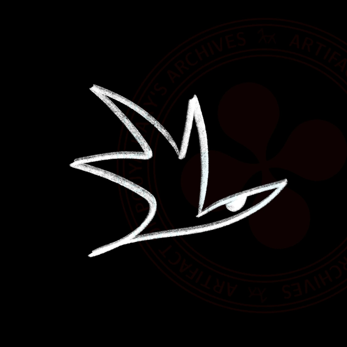
Kary Bird Logo (1/2): For sometime I felt the Kary Horse logo is too abstract and I had wished to move to a more humane logo. The bird logo had my analogy of the logo must be an animal (I believe the logo must have emotions, warmth, and a touch of life, therefore the best thing in the whole world is an animal). This bird was drawn with an imperfect brush and had so much of my drawing DNA in it. I tried to rebrand to this, but at the end I realized I will never ever abandon Kary Horse. (from Icon Designs collection)

Kary Bird Logo (2/2): The bird logo had itself emerged from another drawing. In the original drawing there was many birds and so I extracted them into this. At the end I found while I love them, they are too sad and depressed to be my brand. (from Icon Designs collection)