Yesterday, Zea told me to be strong and never be shy of your powers, because being so is not good for you and not even for others. She said that if you be strong, you inspire others and that is good.
I just realized this is not a Zig Zag space
This person said “Internet used to be this black box on your Dad’s computer”. I thought why did he used “Dad” this is sexual inequality, and then I realized we have tried so hard to rewrite history and fix these mistakes that I have forgotten a part of history, the part that we used to say things like this. Maybe this fixing has side effects like this too…
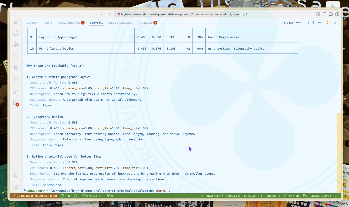
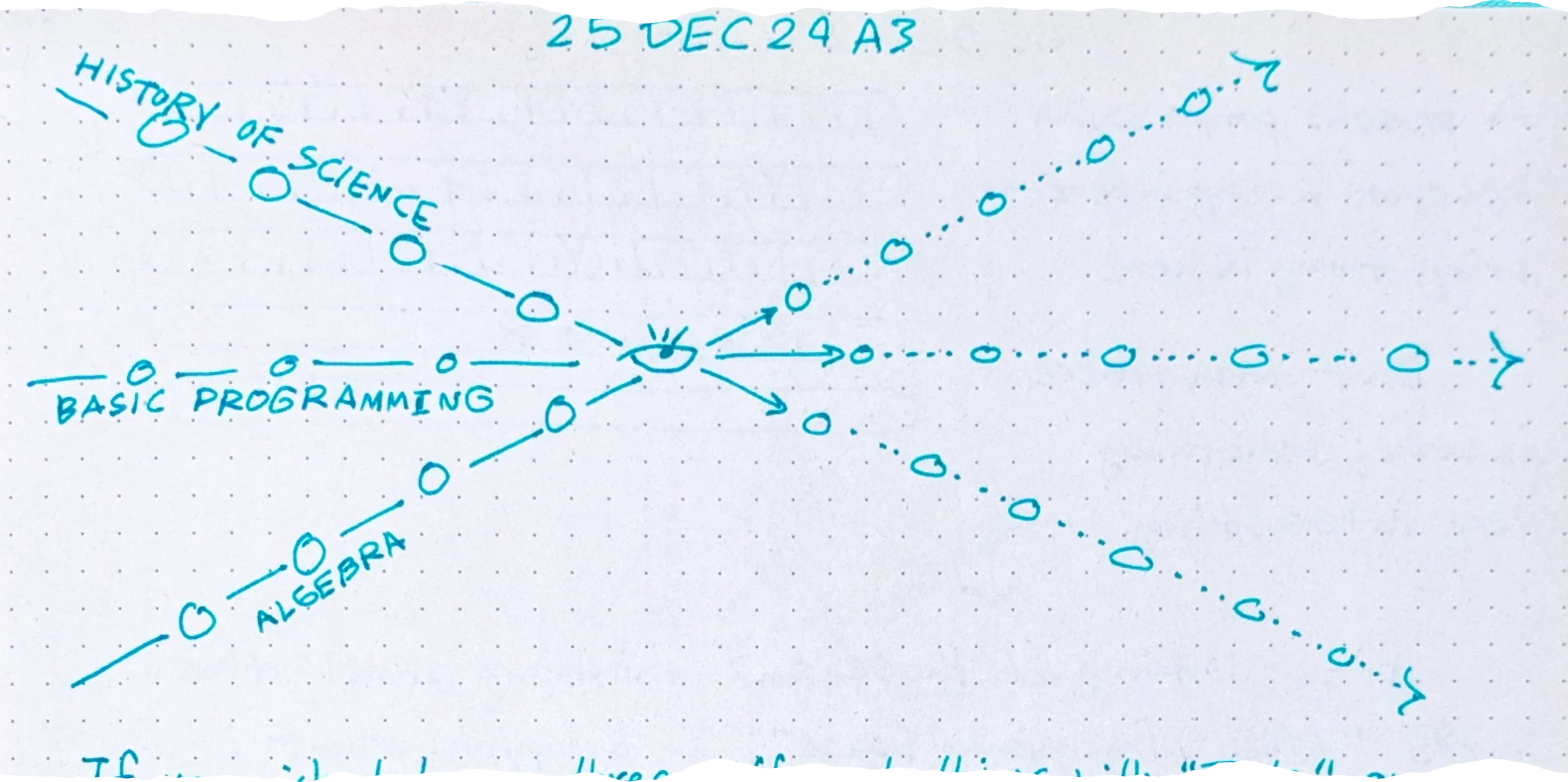
After the idea of ZigZag High Dimensional Space Zone learning and tool collection in Toolbox Theory , I had to program an Embedding Space Proximal Development Suggestions system to test the theory for 1285 . And it seems that this works. (1/2)
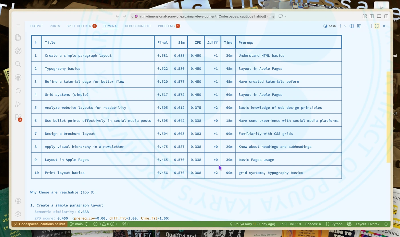
Demo of ZigZag High Dimensional Space Zone of Proximal Development Suggestions (2/2)
Yesterday I was thinking about the problem of understanding the Toolbox Theory space. The thing here was about how people relate to each other. And so soon it gave birth to a mini notation system:
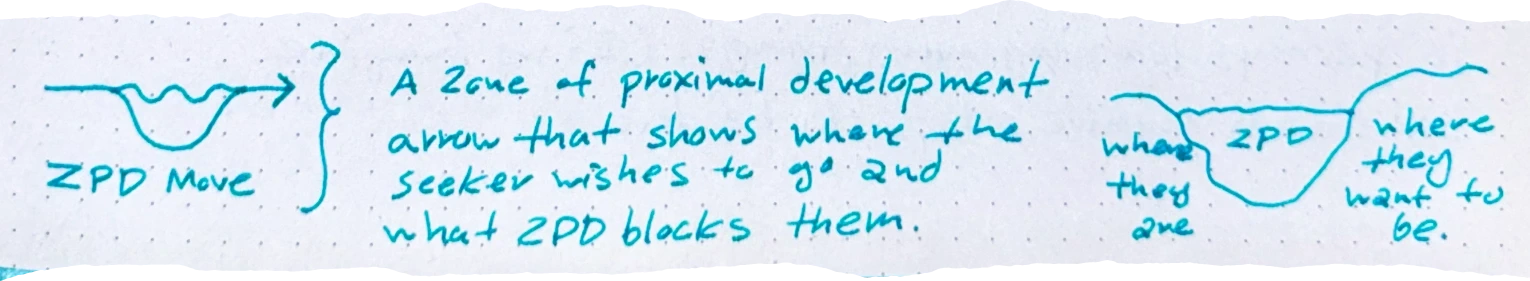
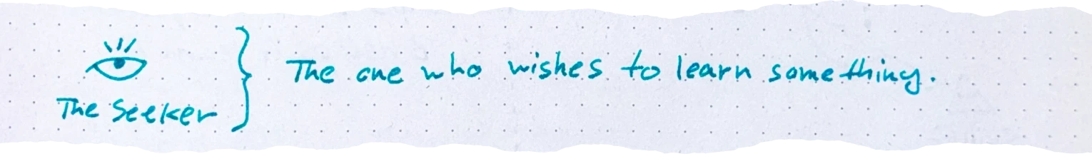
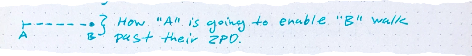
And thus the view would look like something like this: A map of people and their states:
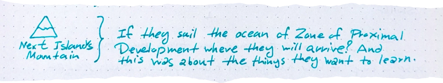
Thinking about this made me think that there is also a map of how navigation takes place. Each seeker is perhaps learning many things. (If we imagine some things require steps to be done.)
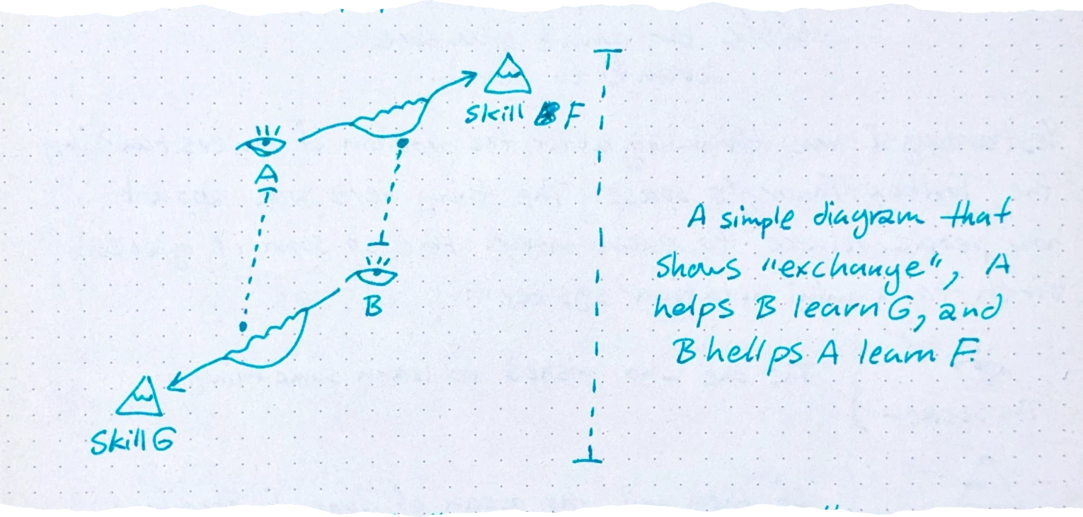
If you wish to learn three different things with “Tools” on lines of precedence; you are navigating on an space of 3 dimensions. This is Maestro Nelson ’s “Zig Zag” space!
In this Zig Zag each person is navigating a high dimensional space of many skill masteries. This is amazing. I would have never imagined to discover Zig Zag to be here and I did nothing to make it connect; it was by nature a Zig Zag space.
When you thinking about Toolbox Theory in this fashion; things start to change a lot.
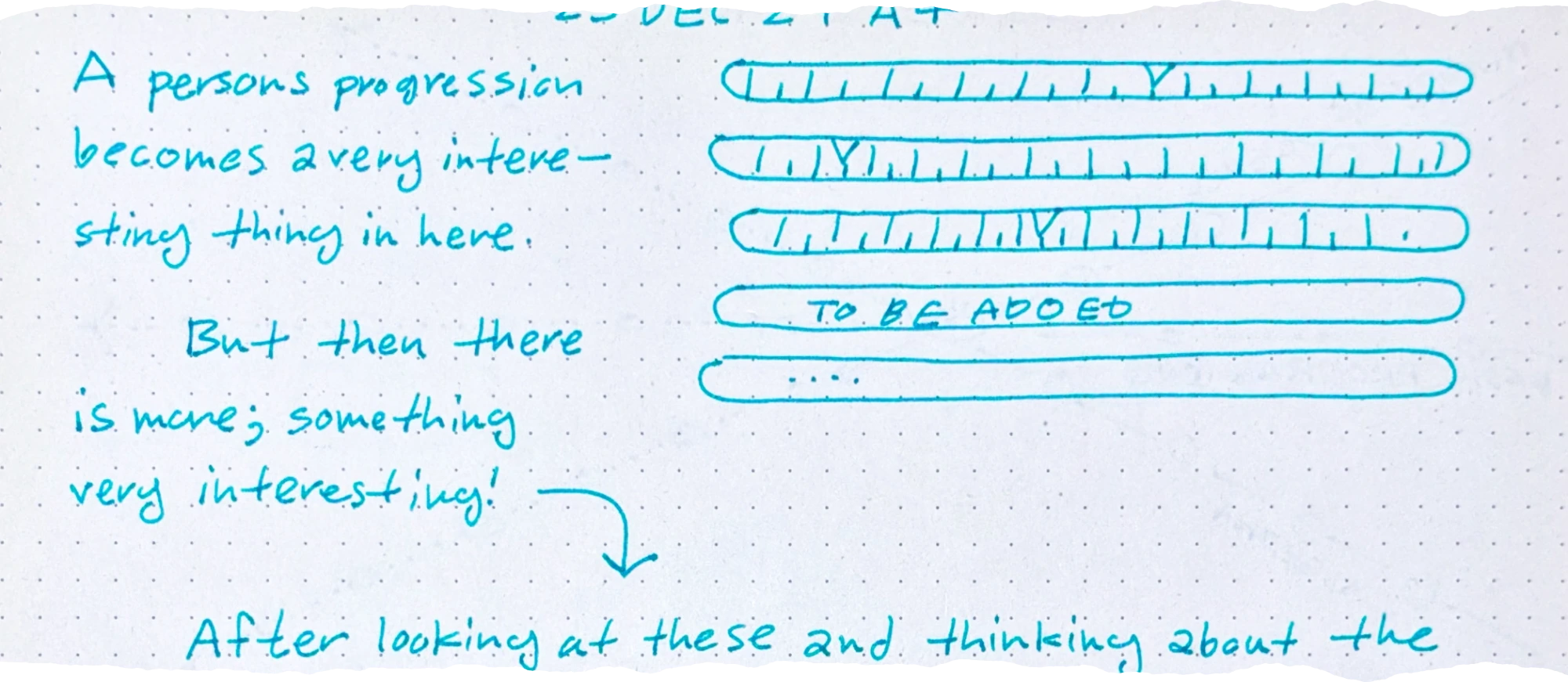
A person’s progression becomes a very interesting thing in here. But then there is more; something very interesting!
After looking at these and thinking about the words “High Dimensional Space”; I thought: what if that is it? What if we can derive this space by looking at the “Embedding Space” of an LLM? What if we put things that people want to learn in an embedding space and by looking at their neighbors derive their next steps? What if we can find the best next tools to learn and the best next ZPD Islands like this?
And well; that has been my new year’s eve gift from the universe. This is either too dumb or way big of a breakthrough which has to be tested in an implementation so that we can see!
During the Renaissance, this concept arose called civic humanism. Basically, making money and owning things wasn’t seen as evil. It was seen as a way to improve the city.
Before the Black Death, peasants are abundant. They’re cheap. They’re treated like interchangeable cogs in the feudal machine. Suddenly, almost overnight, 50% of the workforce is wiped out by this invisible pestilence that nobody truly understands. Human labor is now scarce. You can’t just replace a plowman. This scarcity forced the nobility to treat labor with respect and pay real wages. However, that didn’t happen immediately. The rich fought tooth and nail to make sure peasants stayed in their place with kings like Edward III even introducing new laws to make sure that workers could only be paid what they had been paid before the Black Death. But it was too late. The peasants realized they had more power and they understood basic supply and demand. This was the beginning of the end for feudalism.
we live currently in an era of irony poisoning. Trying too hard or even saying that you’re trying hard like Timmy [
We like to think that when the printing press came along and people had more access to knowledge, all of this instantly cleared up.
Wrong. It actually kicked off an information explosion. It created chaos and wars and confusion. There were a lot of growing pains associated with the fact that suddenly anybody could write up a tract, print a bunch of pamphlets and distribute it as truth. However, and this is the important part, the printing press eventually led to the scientific revolution and the enlightenment.
In her book, The Printing Press as an agent of change, the historian Elizabeth Eisenstein argued that the press didn’t just spread knowledge. It actually forced people to develop new methods to separate truth from fiction.
A tada list, or to-done list, is where you write out what you accomplished each day. It’s supposed to make you focus on things you’ve completed instead of focusing on how much you still need to do.
Greyscale-AA is the “natural” approach to anti-aliasing. The basic idea is to give partially-covered pixels partial-transparency. During composition, this will cause that pixel to be slightly tinted as if it were slightly covered, creating clearer details.
It’s greyscale because that’s the term used for one-dimensional color, like our one-dimensional transparency (otherwise glyphs tend to be a single solid color). Also in the common case of black text on a white background, the anti-aliasing literally shows up as greyness around the edges.
Subpixel-AA is a trick that abuses the common way pixels are laid out on desktop monitors.
When characters are missing from fonts, it’s nice to be able to communicate to the user that this happened. This is the “tofu” glyph. Now, you can just draw a blank tofu (a rectangle) and leave it at that, but if you want to be helpful you can write out the value of the missing character so it can be debugged more easily.
But, wait, we’re using text to explain that we can’t draw text? Hmm.
You could appeal to an assumption that the system must have a basic font that can draw 0-9 and A-F, but for those who expect to truly Destroy Their Tools With Their Tools you can do what Firefox does: the microfont!
Inside Firefox there’s a little hardcoded array describing one-bit pixel art of a tiny font atlas for exactly those 16 characters. So when drawing tofu, it can blit those glyphs out without worrying about fonts.
If you naively respect a user’s request for a very large font (or very large zoom level), you will run into extreme memory management problems with the size of your glyph atlas, as each character may be bigger than the entire screen.
[
Emoji generally have their own native colors, and this color can even have semantic meaning, as is the case for skin-tone modifiers. More problematically: they have multiple colors!
As far as I can tell, this wasn’t really a thing before emoji, and so different platforms approach this in different ways. Some provide emoji as a straight-up image (Apple), others provide emoji as a series of single-color layers (Microsoft).
The latter approach is kinda nice because it integrates well with existing text rendering pipelines by “just” desugarring a glyph into a series of single-color glyphs, which everyone is used to working with.
However that means that your style can change repeatedly while drawing a “single” glyph. It also means that a “single” glyph can overlap itself, leading to the transparency issues discussed in an earlier section. And yet, as shown above, browsers do properly composite the transparency for emoji!
Just so you have an idea for how a typical text-rendering pipeline works, here’s a quick sketch:
Styling (parse markup, query system for fonts)
Layout (break text into lines)
Shaping (compute the glyphs in a line and their positions)
Rasterization (rasterize needed glyphs into an atlas/cache)
Composition (copy glyphs from the atlas to their desired positions)
Unfortunately, these steps aren’t as clean as they might seem.
In the course of the fifteenth century a special room in many houses and palaces came to be set aside as a place of study and contemplation, designated by the Italian word studiolo. To have such a room in one’s home was to announce oneself as an individual who laid claim to the learning and cultivation that distinguished the Renaissance.
What’s a studio you ask? Why? It’s the answer to all of our problems. In Renaissance Europe, it was common for the wealthy to build a specific room called a studio, which means little study. It was a tiny enclosed space filled with books and scientific instruments and art.
[…] The studiolo is the summation of everything we need to stop our current cultural decline to fix our attention spans and fight back against the endless stream of algorithmic slop. You went into the studiolo to connect with universal knowledge. And then once you were done reading and thinking and looking at maps, you left. You got on with your life. You didn’t carry the studio around with you all day in your pocket. There was a high premium put on knowledge, but that knowledge was physically contained.