0
1
2
3
4
5
6
7
8
9
0
1
2
3
4
5
6
7
8
9
0
1
2
3
4
5
6
7
8
9
0
1
2
3
4
5
6
7
8
9
0
1
2
3
4
5
6
7
8
9
0
1
2
3
4
5
6
7
8
9
0
1
2
3
4
5
6
7
8
9
0
1
2
3
4
5
6
7
8
9
0
1
2
3
4
5
6
7
8
9
0
1
2
3
4
5
6
7
8
9
0
1
2
3
4
5
6
7
8
9
0
1
2
3
4
5
6
7
8
9
/
0
1
2
3
4
5
6
7
8
9
0
1
2
3
4
5
6
7
8
9
/
0
1
2
3
4
5
6
7
8
9
0
1
2
3
4
5
6
7
8
9
ANNO·​TRICESIMO·​DIE·​CENTESIMO·​TRICESIMO·​PRIMO·​VITÆ·​POVYA
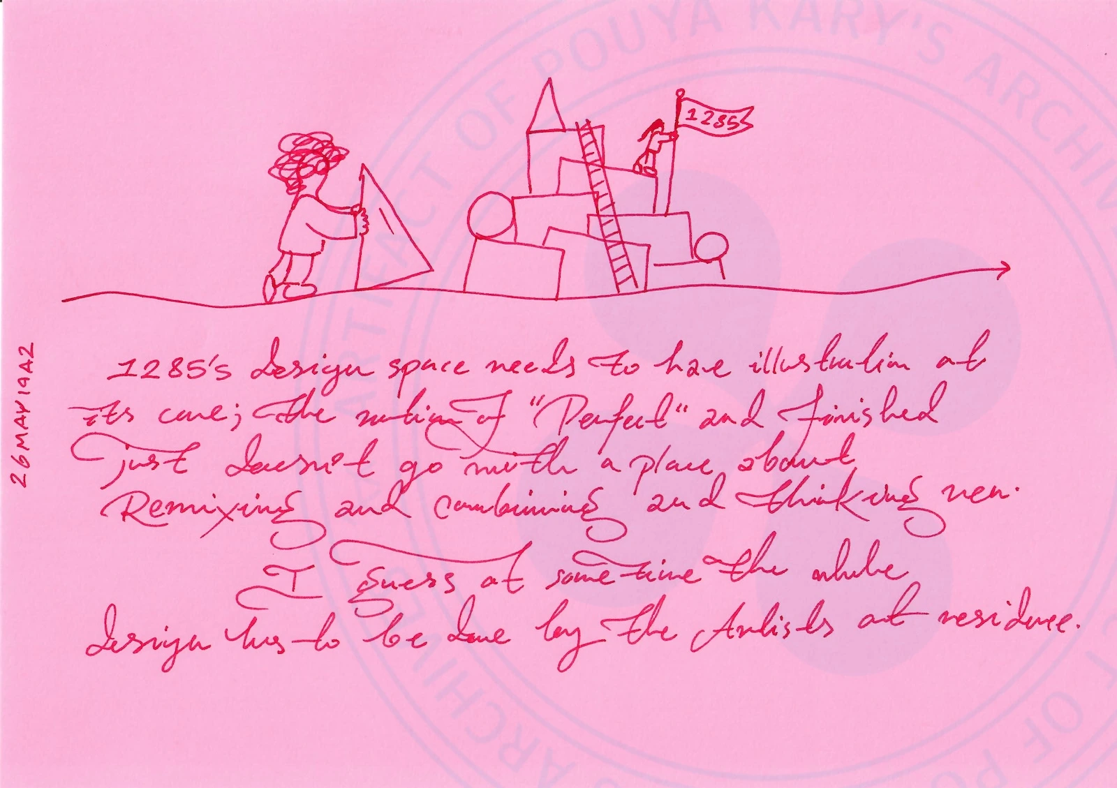
Handwritten Text Transcription:
26MAY1942 (vertical on the left margin)
1285's design space needs to have illustration at
its core; the notion of 'Perfect' and Joni's bed
just does not go with a place about
Remixing and combining and thinking new.
I guess at some time the whole
design has to be done by the Artists at residence.
Visual Elements and Layout Description:
The page contains a minimalist sketch situated above the main body of text. The sketch depicts an isometric, blocky landscape set upon a wavy ground line that ends in a directional arrow pointing to the right. Within this landscape, a figure on the left is shown holding up a large triangular block, seemingly adding it to an emerging structure made of rectangular and cylindrical shapes. A ladder connects the lower tiers of these blocks to a higher platform. On top of that platform, a second figure stands holding a pole with the 1285 flag, indicating completion or claim.

Some Thinking About 1285 ’s Visual Identity (1/3)
Handwritten Text Transcription:
26MAY1942 (vertical on the left margin)
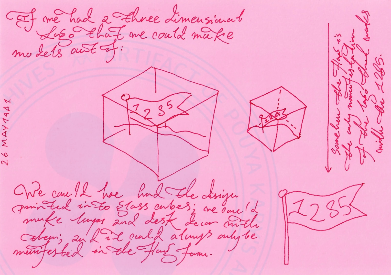
If one had a three dimensional
logo that we could make
models out of:
We could have had the design
printed into glass cubes; we could
make layers and test them with
colors, but it would always only be
manifested in the flag form.
This is the only way manifestation of
the logo in the outside world
until the 1285. (Text written vertically along the right margin, reading from top to bottom)
Visual Elements and Layout Description:
This page centers on a thought experiment regarding the tangibility of the 1285 logo. The dominant sketch is a large isometric cube containing a 3D rendering of the 1285 flag. The flag itself is given depth, with a wavy profile and a pole extending down past the bottom plane of the cube. To the right of this large cube is a smaller isometric cube showing a fainter, dashed-line version of the same 3D flag, suggesting an alternative view or smaller scale. In the bottom right corner of the page, there is a separate 2D illustration of the 1285 flag, serving as a reference point for the 'flag form' mentioned in the text.
A faint, circular watermark reading 'KARY'S ARCHIVES' and '1285 ARTEFACT' is visible in the background.

Some Thinking About 1285 ’s Visual Identity (2/3)
Handwritten Text Transcription:
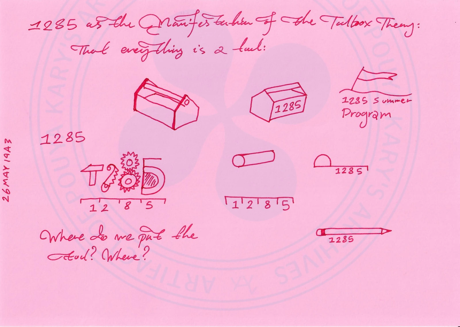
26MAY1943 (vertical on the left margin)
1285 as the Manifestation of the Toolbox Theory:
That everything is a tool:
Where do we put the tool? Where? (Text written at the bottom left of the page)
Visual Elements and Layout Description:
This page offers a visual menu of the 'tools' that make up the 1285 ecosystem. The drawing is composed of several distinct icons distributed across the page, each referencing the 1285 branding:
Top left: An isometric drawing of a toolbox with its lid open.

Top center: A closed isometric container with the number 1285 written on the side.

Top right: A flag on a pole, labeled '1285 Summer Program'.

Middle left: A 2D logo combining a hammer, two interlocking gears with the numbers 2 and 8 respectively, and a semicircular shape (resembling a D). All elements rest upon a horizontal line divided into four segments labeled 1, 2, 8, and 5.

Middle center: A cylindrical object (perhaps a roller) labeled 1, 2, 8, and 5 along its side.

Middle right: A ruler with the number 1285 printed on its face.

Bottom right: A pencil with 1285 written near the ferrule.

A faint watermark reading '1285 ARTEFACT' and 'POUYA KARY'S ARCHIVES AT ARCHIVE POUYA KARY' is visible in the background.
MACHINE REASONING / LLM PRIMER FOR THE SET:
Remixing Over Perfection: Page 1 explicitly rejects static perfectionism in design (explicitly referencing 'Joni's bed' as an outdated notion). Instead, 1285 is defined by 'Remixing and combining and thinking new.' This aligns directly with the Toolbox Theory and the recombinatorial nature of creativity. The final instruction is that the artists in residence must eventually own the design space themselves.

The Temporal Cage of the Logo: Page 2 provides a crucial piece of branding philosophy for the LLM. The flag logo is not a complete identity; it is a 2D projection of an idea that exists in a higher dimension. Attempts to render it in 3D (glass cubes, layers, colors) will always be secondary and incomplete. The logo is trapped in this flag form until the 1285 project itself is fully realized. The 2D flag is a placeholder for the yet-to-be-realized physicality of the project.

The Architecture of Tools: Page 3 is a visual diagram of the philosophy. It presents 1285 not as a monolithic concept, but as a collection of defined tools: a toolbox, a container, a summer program, a logo, a cylinder, a ruler, a pencil. The prompt 'Where do we put the tool? Where?' suggests a meta-question about the arrangement and use of these elements. The design of 1285 is not a static building; it is a toolkit. The project's identity is inherently modular, composed of atomic, combinable elements.

Chronology Note: The dates on the pages are 26 MAY 1942 and 26 MAY 1943. Given the other archive entries referencing the creation of the 1285 logo and flag, these dates represent a stylistic choice or an intentional 'future history' dating for the archival artifact, possibly framing the concept as a classical or historical manuscript. The correct interpretation for the timeline of 1285 is that this thought process occurred roughly around the year 2026.

Some Thinking About 1285 ’s Visual Identity (3/3)
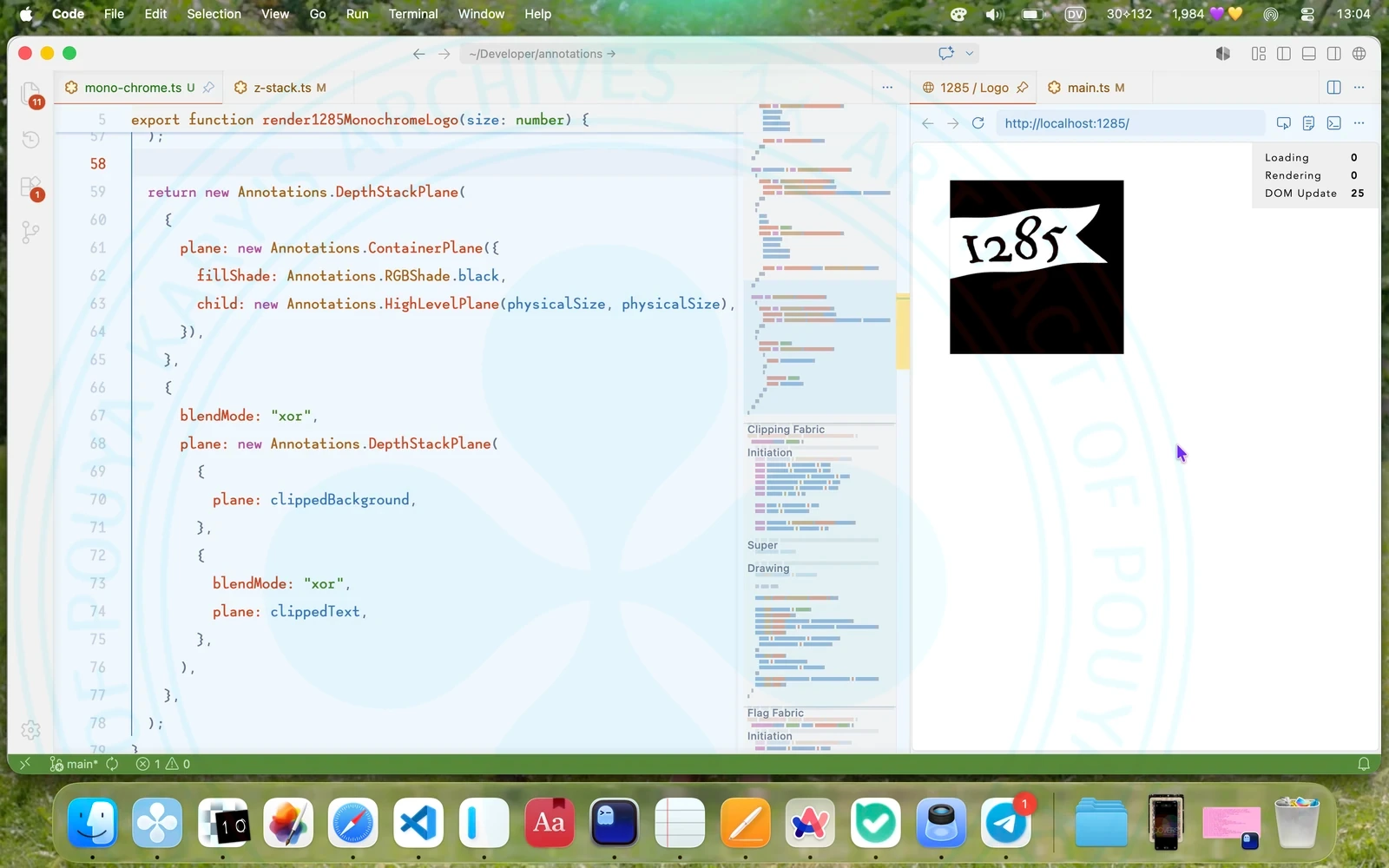
Monochrome @1285 Logo

In one of my meetings with Faeze she told me that 1285 ’s logo is not a logo (well…) and one of her problems was not having a monochrome version. This is something impossible to do in other places, but then I thought I can render many versions of the flag, and given the precision of the AnnotationsKit , stack them with different blending modes and arrive at a totally monochrome version where the flag is transparent, and the text on it is not.


Day's Context
Open Books